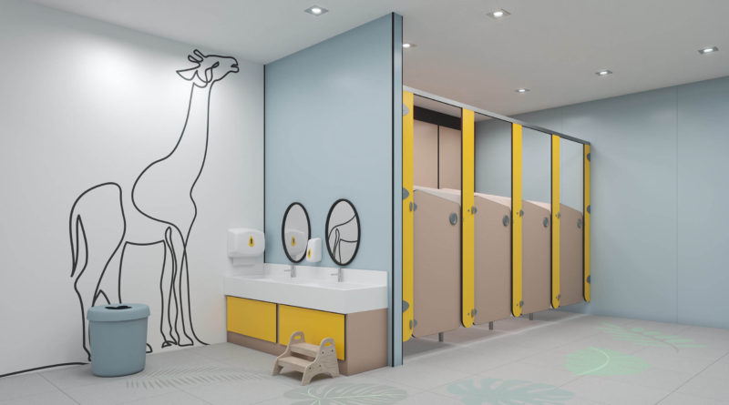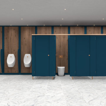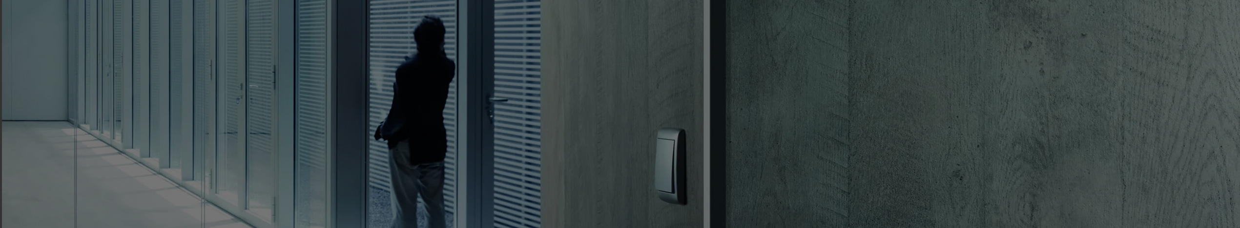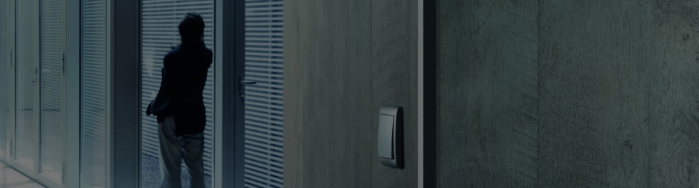

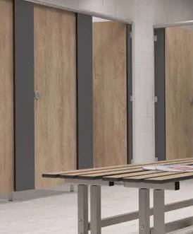
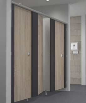

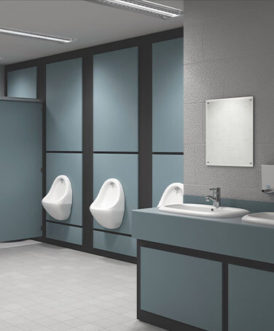

For individuals with sight loss, clear visual distinctions within a building are crucial. Highlighting key architectural features, like columns in walkways, helps them navigate safely. This principle of contrast – making elements stand out rather than blend – should extend to handrails, stairs, doors, and even light switches. Colour and tonal contrasts are the most effective tools for achieving this, often enhancing even well-coordinated colour schemes.
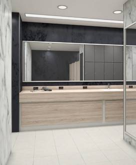
Good lighting is equally vital for everyone. Adequate levels, well-placed fixtures, and minimising glare are essential for creating a welcoming environment. Poor lighting can negate other visibility aids due to shadows and optical illusions.
Ultimately, accessible design hinges on three core elements: logical layout, strong visual visibility, and effective lighting. These factors, alongside tactile cues, sound, and air movement, contribute to inclusive spaces that are easy to navigate and understand for all users. By incorporating these principles – clear layout, colour/tone contrast, even lighting, sensory cues, and tactile signage – we create environments that are truly welcoming to everyone.
Designing Visually Accessible Interiors
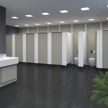
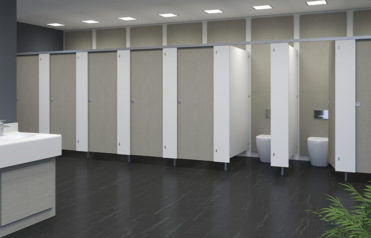
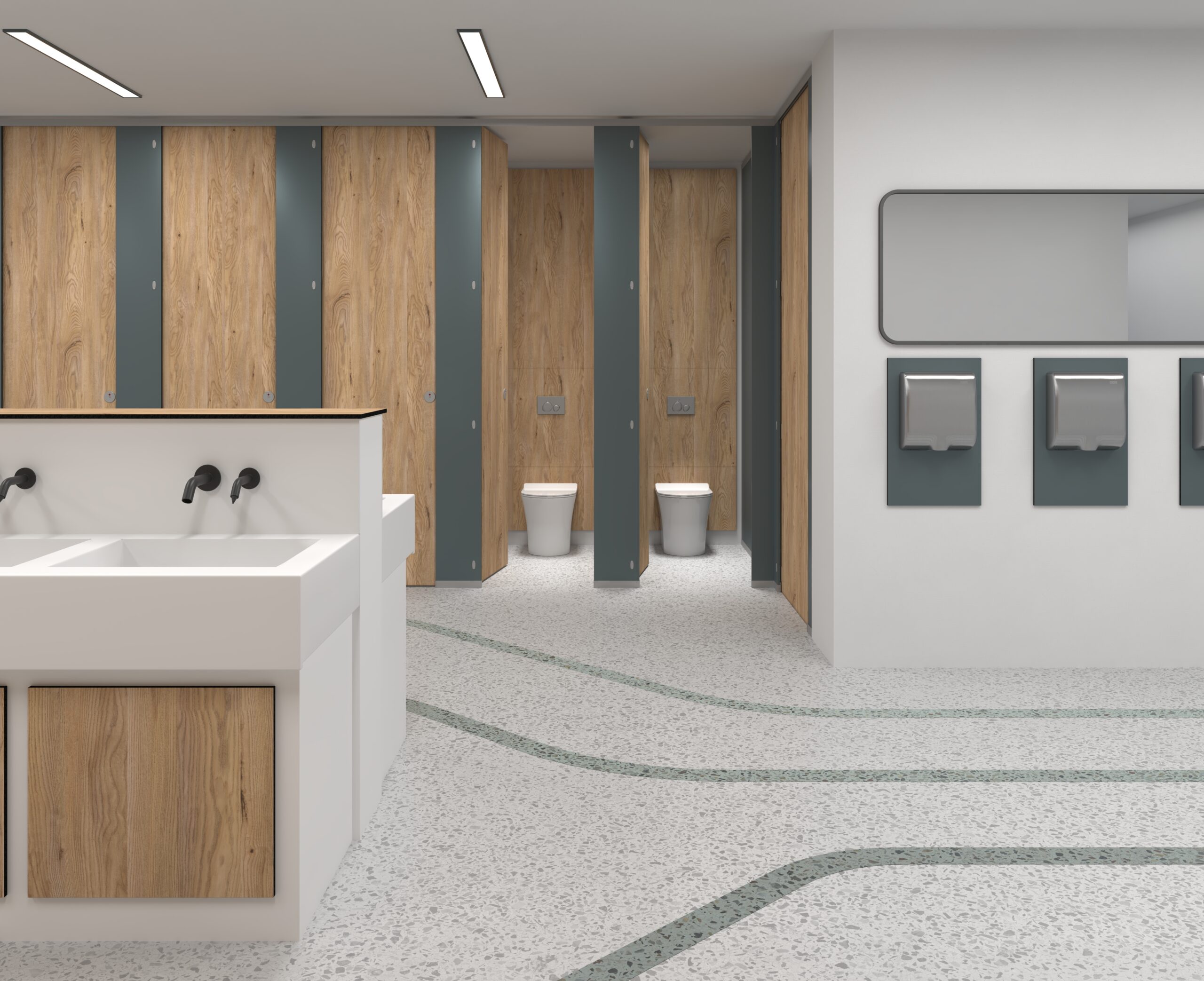
Creating interiors that are accessible for individuals with sight loss involves careful consideration of colour, texture, and light reflectance. Walls and ceilings should ideally be finished in pale, matte tones to maximise light and minimise glare. Floors should be plain and matte, contrasting with the walls for clear visual boundaries. Doors and hardware, as well as switches, sockets, and other essential elements, should also strongly contrast with their surroundings for easy identification.
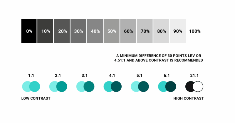
The key to achieving this contrast is Light Reflectance Value (LRV). LRV is a measure of how much light a surface reflects. It’s a scale from 0 (perfectly absorbing, black) to 100 (perfectly reflective, white). In accessible design, LRV differences between surfaces are used to create visual contrast, making spaces easier to navigate for people with sight loss. A significant difference in LRV between adjacent surfaces is crucial for visibility. For large areas like walls, floors, and doors, a minimum LRV difference of 30 points is recommended. For potential hazards, small items, and self-contrasting markings, this difference should be at least 60 points. Text and symbols on signs require an even greater contrast, with an LRV difference of 70 points. Reflective surfaces require higher contrast values.
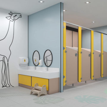
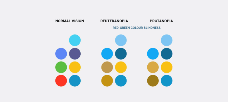
When considering red-green colour-blindness, focus on strong LRV contrast, avoid red/green as differentiators, use textures/patterns, incorporate labels where appropriate, and test with colour-blindness simulators for accessible interiors.
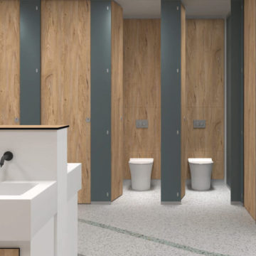
Wall finishes should be plain and matt to avoid glare and allow for tactile exploration. Contrasting skirting boards can further aid navigation, especially for those with limited peripheral vision. These guidelines ensure that interiors are not only aesthetically pleasing but also safe and navigable for everyone.
Designing Calm: Interiors for Neurodiversity
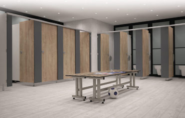
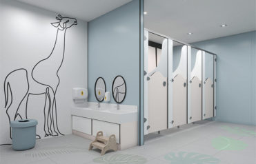
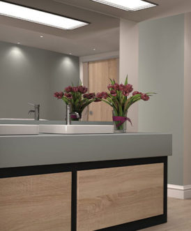
Similar to designing interiors for those with sight loss, designing interiors for the neurodivergent necessitates a thoughtful approach to colour, tone, and texture, prioritising calm and predictability over stimulating environments. A palette of soft, muted colours, such as blues, greens, and neutrals, is often preferred, avoiding the jarring effect of bright, intense hues. Consistency in colour usage throughout a space creates a sense of order, while subtle tonal gradations are favoured over stark contrasts. Matt finishes are essential, as they minimise glare and reflections, contributing to a more comfortable visual experience. Lighting should be even and consistent, free from harsh shadows or bright spots that can cause discomfort. Texture plays an equally important role; soft, natural materials like wood and cotton offer a calming tactile experience, while highly patterned or rough textures are best avoided. Ultimately, the goal is to create spaces that are adaptable and personalised, recognising the diverse needs within the neurodiverse community. Sensory zoning, providing areas with varying levels of stimulation, and a minimalist approach to clutter further enhance the sense of calm and well-being. By carefully curating sensory input, interior design can become a powerful tool in supporting neurodiverse individuals.